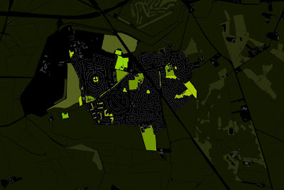
Recently I have been experimenting with a new graphic style to allow the message the plan is trying to convey more legible and easier to 'spot'. This has involved using colours of various brightness on top of a dark base. The paths or spaces at the top of the hierarchy are assigned the brightest (more contrasting with black) colours, with them getting gradually darker the further down the hierarchy you go. This results in a plan where the most important elements contrast and stick out from the dark background, and the less important elements almost indistinguishable from it.
Below the most used/public green spaces are in the brightest with the lesser/more privatised spaces getting gradually darker. This plan not only shows where the most used spaces are and where there is a lack of
greenspace, but also how the spaces connect with each other and which spaces need to be improved/expanded to create a stronger green network.

Below the
technique allows you to easily
identify the movement hierarchy of a town and the 'voids' of space where new connections are needed.


