![](https://blogger.googleusercontent.com/img/b/R29vZ2xl/AVvXsEgGh5-WfdANQexOcLNi58mQfmE5XgUjZ5W2au7okxCH1R9x9wDnJYMk530f9f5spJsIGN2EFr5e8Ba7Nbp2WfiouJBncbdYYrf7on11EC1rVeBiNQX6tLU3shHNJse-mOVzu0pakbjDKUEm/s400/bus.jpg)
The Blackout Bus
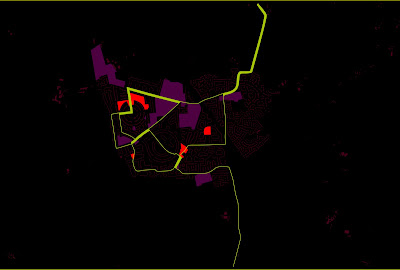
This plan represents the most accessible places in a town. The red and purple areas represents the destinations and the green line the bus route. The line increases in thickness the more bus routes travel along that section. A destination that has a thin line next/through it is less accessible (has fewer buses going past) than destinations with thicker lines (more buses going past).
![](https://blogger.googleusercontent.com/img/b/R29vZ2xl/AVvXsEgGh5-WfdANQexOcLNi58mQfmE5XgUjZ5W2au7okxCH1R9x9wDnJYMk530f9f5spJsIGN2EFr5e8Ba7Nbp2WfiouJBncbdYYrf7on11EC1rVeBiNQX6tLU3shHNJse-mOVzu0pakbjDKUEm/s400/bus.jpg)