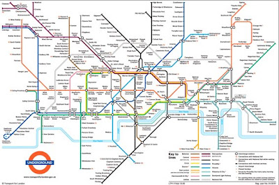
I think that the London Underground map is a masterpiece of graphic design. Simple and clear to understand it is one of the easiest maps you are ever likely to use.
*Someone* has however has looked at the map in a way no one has ever thought of before and has seen a whole world of animal life contained in the network of underground tunnels.
Roadsworth
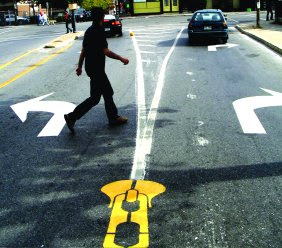
Peter Gibson (aka Roadsworth) began painting the streets of Montreal in autumn 2001. He was motivated by a desire for more bike paths in the city and a questioning of “car culture” in general.
I really like the sentiment behind this graffiti and think that it conveys some very strong messages about how the car and roads are so dominant in the urban landscape, with its needs prioritised over the pedestrians.
Is this trying to express that people shouldn't be forced to cross roads at designated points. Could it be the case that once a crossing is designated on a street then this will be the only place that people will ever be able to cross at. Cars wont slow to allow pedestrians cross anywhere else on the street because they think the pedestrians should be using the crossing, thereby forcing pedestrians to use the crossing even if it is out of their way to do so. Prehaps if that crossing was never there then pedestrians would attempt to cross the road an numerous points making cars more cautious and so more likely to slow down and allow pedestrians to cross? Does..........
Are car parks destroying destroying the fragile and beautiful natural landscape? The more dominant we are on the car the more we need car parks. The more car parks we build the less greenspace we have. The less greenspace we have the less we are likely to want to do for a walk. The less we walk the more dominant we are on the car. The more dominant we are on the car...
Are roads tearing communities apart? Unzipping socail connections?
Is the need to design out any possibility of any risk in a public space and the street clutter that this will lead to, killing the life of public spaces? Im not sure if the image above is by the same person but I think it shares the same sentiments.
Dymaxion Map
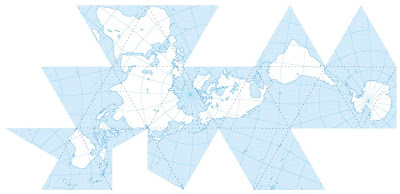
The Dymaxion map of the Earth is a projection of a global map onto the surface of a polyhedron, which can then be unfolded to a net in many different ways and flattened to form a two-dimensional map which retains most of the relative proportional integrity of the globe map. It was created by Buckminster Fuller
Nolli
Giambattista Nolli (1701-1756) was an architect and surveyor who lived in Rome and devoted his life to documenting the architectural and urban foundations of the city. The fruit of his labor, La Pianta Grande di Roma ("the great plan of Rome") is one of the most revealing and artistically designed urban plans of all time. The Nolli map is an ichnographic plan map of the city, as opposed to a bird’s eye perspective, which was the dominant cartographic representation style prevalent before his work.
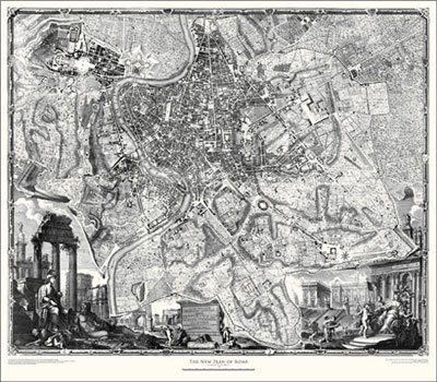
The Nolli map provides an immediate and intuitive understanding of the city’s urban form through the simple yet effective graphic method of rendering solids as dark gray (with hatch marks) and rendering voids as white or light shades of gray to represent vegetation, paving patterns and the like. The city, thus conceived as an enormous mass that has been "carved" away to create "outdoor" rooms is rendered intelligible and vivid through this simple graphic convention.
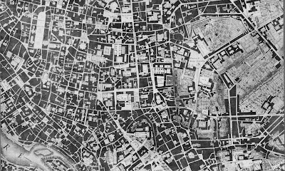
The idea of solid/void is closely related to the idea of figure/ground. The dark and light patterns of the city reveal the manner in which public space in the city is conceived no less carefully than building. In Rome, public or semi-public space possesses a distinct and identifiable character whether it is a church interior, palace courtyard or public urban space. The Piazza Navona, for example, is easily identified as a "figural" element in the city, with the surrounding buildings acting as a back up field or "ground" into which the element has been placed, or rather, carved away. In contrast, the Modern city reverses this conceptual reading so that building is always seen as active figural object while space is imagined (if at all) as a kind of recessive, formless ether or receptacle that provides the setting for the object. In Rome, solid and void readings have the capacity to be interpreted as either figure or ground.
Letting your Hands do the Talking
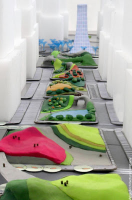
I love how engaging this model is. Can you imagine turning up to a community consultation event with this on the table and then being told you can play with it. From my experience with comcon so many people have trouble explaining what they want, why not give the the chance to make it?
Fom now on I think all models should be made from PlayDough
Subscribe to:
Posts (Atom)