
Showing posts with label Graphics. Show all posts
Showing posts with label Graphics. Show all posts
Model Maker #1 - 2 storey 3 bed terrace
The Urban Refine Model Maker is launched! I will be creating a series of flat pack house models that can be easily assembled and used to make simple models.

Ring Roads
The other day I can across this nice little image of the ring roads of the world by Rice school of architecture.

And I decided to do one for the cities of Great Britain.

Ring roads are significant features within cities and very often form the centre piece of a cities movement network. They do however only ever form part of the vehicle network and often little consideration is given to how pedestrians and cyclists will cross the ring road barrier. All to often pedestrians and cyclists will be forced into an underpass or overpass, which very few of us ever want to do.
CharacterLess Areas

Thought it was interesting looking at a character area plan without a base. I though it was surprisingly informative, but maybe that's because I know what the masterplan looks like? I would be interested in seeing others!
Portfolio: A round Plan
Aspirations for Garden Cities of Today

Based on Ebenezer Howard's Garden Cities plans, an illustration for an eco-borough in Yorkshire.
Village Life

A simplified land use plan for a village that zones areas in order to quickly analyse adjoining land uses.

Based on Ebenezer Howard's Garden Cities plans, an illustration for an eco-borough in Yorkshire.
Village Life

A simplified land use plan for a village that zones areas in order to quickly analyse adjoining land uses.
ComplexCity
From http://www.leejangsub.com/
This project is an exploration to find a concealed aesthetic by using the pattern formed by the roads of the city which have been growing and evolving randomly through time, thus composing the complex configuration we experience today. I perceive the city's patterns as living creatures that I recompose to form an urban image.

Seoul


Rome

Paris
Moscow
This project is an exploration to find a concealed aesthetic by using the pattern formed by the roads of the city which have been growing and evolving randomly through time, thus composing the complex configuration we experience today. I perceive the city's patterns as living creatures that I recompose to form an urban image.

Seoul


Rome

Paris

Moscow

I think these are beautiful images and remind me of the pedestrian and road network diagrams I have done in my BLoackout series. Click the Blackout label for more information.
Speed Divides ?idea?
?Idea? How do you easily represent possible barriers in a neighbourhood. Assuming that in an urban area road speed equates to how busy the road is likely to be, and the busier the road the less likely that residents either side interact? Graphically, the thicker the line (roads - 70mph = 70pt, 30mph=30pt etc) the harder it is for the blocks (neighbourhoods) to mix. Therefore a design needs to try and make these lines thinner to increase social interaction in an area???

Typography of Masterplans
After seeing my good friend Panos experiment with typographical architecture, I thought it would be interesting to have a go at typographical masterplanning.
1. The base

2. Add the typography

3. The typographical masterplan

Although I think the experiment has produced an interesting result, I cant say it has produced a clear, legible plan when viewed as a single entity. However while playing around with the layers I noticed that maybe less is sometime more.
Figure Ground Plan

Road Network

Landscape
Public Realm
You can also get interesting but equally illegible results by maintaining a single colour.
1. The base

2. Add the typography

3. The typographical masterplan

Although I think the experiment has produced an interesting result, I cant say it has produced a clear, legible plan when viewed as a single entity. However while playing around with the layers I noticed that maybe less is sometime more.
Figure Ground Plan

Road Network

Landscape

Public Realm

You can also get interesting but equally illegible results by maintaining a single colour.


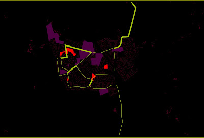
The Blackout Bus
This plan represents the most accessible places in a town. The red and purple areas represents the destinations and the green line the bus route. The line increases in thickness the more bus routes travel along that section. A destination that has a thin line next/through it is less accessible (has fewer buses going past) than destinations with thicker lines (more buses going past).

The Blackout
Recently I have been experimenting with a new graphic style to allow the message the plan is trying to convey more legible and easier to 'spot'. This has involved using colours of various brightness on top of a dark base. The paths or spaces at the top of the hierarchy are assigned the brightest (more contrasting with black) colours, with them getting gradually darker the further down the hierarchy you go. This results in a plan where the most important elements contrast and stick out from the dark background, and the less important elements almost indistinguishable from it.
Below the most used/public green spaces are in the brightest with the lesser/more privatised spaces getting gradually darker. This plan not only shows where the most used spaces are and where there is a lack of greenspace, but also how the spaces connect with each other and which spaces need to be improved/expanded to create a stronger green network.
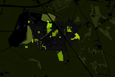
Below the technique allows you to easily identify the movement hierarchy of a town and the 'voids' of space where new connections are needed. 
Below the most used/public green spaces are in the brightest with the lesser/more privatised spaces getting gradually darker. This plan not only shows where the most used spaces are and where there is a lack of greenspace, but also how the spaces connect with each other and which spaces need to be improved/expanded to create a stronger green network.

Below the technique allows you to easily identify the movement hierarchy of a town and the 'voids' of space where new connections are needed.

Underground Zoo
I think that the London Underground map is a masterpiece of graphic design. Simple and clear to understand it is one of the easiest maps you are ever likely to use.
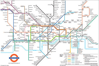
*Someone* has however has looked at the map in a way no one has ever thought of before and has seen a whole world of animal life contained in the network of underground tunnels.


RIP Norman, 10th March 2008 - 18th June 2008

*Someone* has however has looked at the map in a way no one has ever thought of before and has seen a whole world of animal life contained in the network of underground tunnels.


Its amazing what you can find if you just look at things a little differently. A friend once found a robot (named Norman) lurking in one of my masterplans. Sadly however due to major changes in the development he will never come to life

RIP Norman, 10th March 2008 - 18th June 2008
Subscribe to:
Posts (Atom)
