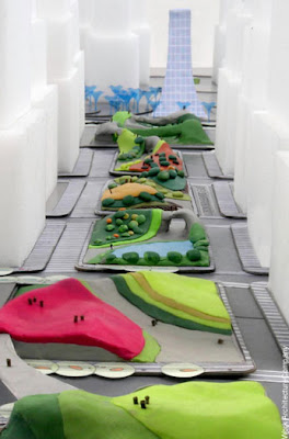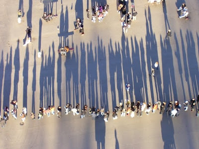
Playing with Squares
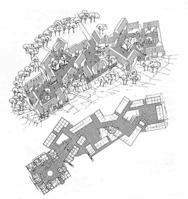
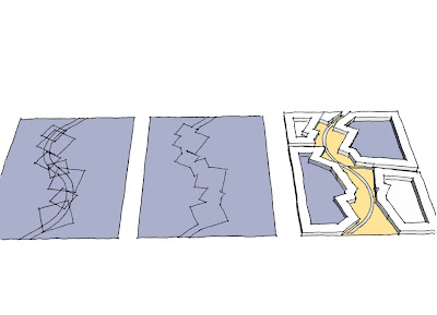
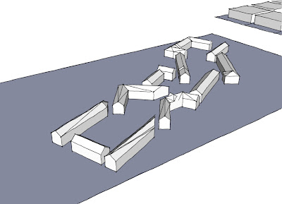
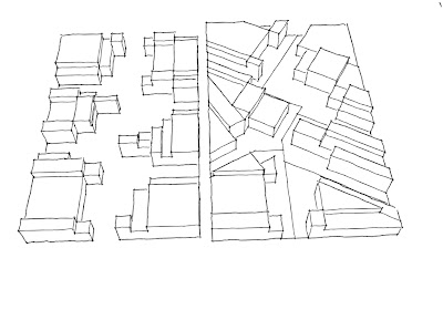
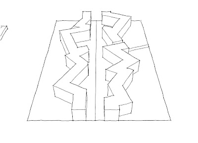
It shows how the subdivision of residential areas in Scandinavian housing schemes into groups of 15-30 dwellings has been found to work quite well in encouraging social networking. I stating thinking about this and how the rotation of these squares on only creates an interesting visual place but also one good for social interaction. So I started playing with this idea of simply rotating a series of squares along a street to see what kind of place I can up with.
Place Making - High Street Kensington
Slopes & Bunds
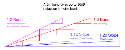
The Disability Discrimination Act
Planting schemes will have no mitigation effect against noise.
With regard to air quality, the bunds will make little difference in terms of mitigating emission from the colliery operations – air pollutants simply disperse over the top of them and return to ground level almost immediately over the other side. Planting schemes are more likely to be successful in reducing air pollution, specifically in term of providing a mitigation measure against dust provided that the vegetation is sufficiently dense.
Place Making - Zones of Exclusion
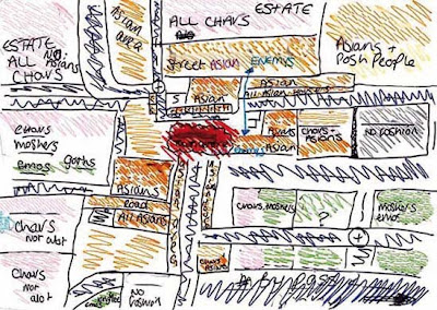
Researchers at the University of Glasgow, sponsored by the Joseph Rowntree Foundation, have spent the past two years asking young residents of Bradford, Peterborough, London, Glasgow, Sunderland, and Bristol to draw maps of their own individual urban experience in order to explore micro-territoriality as both a cause and a symptom of social exclusion. You can read the full PDF of their report here.
“In Glasgow, Sunderland and Bradford,” they found, “a recognizable territory might be as small as a 200-meter block or segment.” In Tower Hamlets, London, fifteen and sixteen-year old boys mapped their world into three streets, a football pitch, a barber shop, mosque, Indian restaurant, and – just beyond the clearly marked “Front Line” – an off-license, or liquor store.
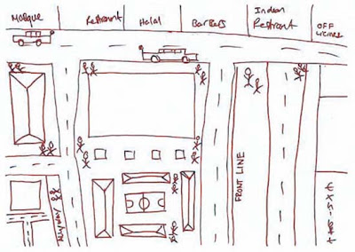
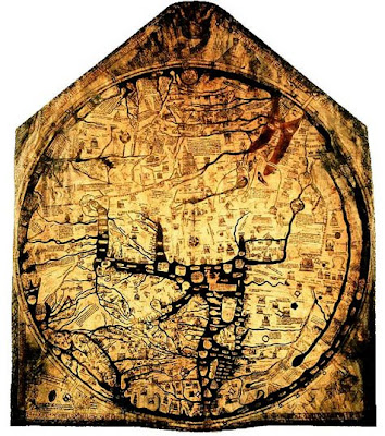
Some of the sketches even remind me of medieval maps: the known world is an island of familiarity, simultaneously shown much larger than scale but made tiny and precious by the monsters of “Terra Incognita” that surround it.
In the case of a 15-year-old girl from Bradford, today’s dragons are “moshers,” “chavs,” “Asians,” and “posh people” – all “Enemy's.”
The researchers found that teenage boys display an even more complete ignorance of the world beyond their perceived boundaries: these two maps of the same area in Glasgow were drawn by young men in the same class at the same school, who live on different sides of the same road.
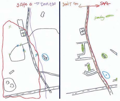
The report’s authors examined the causes, nature, and impact of micro-territorialization. Their research uncovered Bristol’s “postcode wars,” where gangs spray-paint their postcode in rival areas as a form of aggression, as well as descriptions of the maneuvers involved in going to school in one part of Bradford that match the Schlieffen Plan in strategic complexity. “In some places,” they note with reference to Glasgow and Sunderland, “territoriality was a leisure activity, a form of ‘recreational violence.’” In other words, bored and economically deprived teenagers are transforming 1960s council estates and Victorian terraces into a real-world, multiplayer World of Warcraft.
Of course, excessive loyalty to the local, and the resulting lack of mobility, has a significant and negative impact on access to education, services, and job opportunities. In the words of one interviewee from Glasgow:
If your horizons are limited to three streets, what is the point of you working really hard at school? What is the point of passing subjects that will allow you to go to college or university if you cannot travel beyond these streets? What’s the point of dreaming about being an artist, a doctor, etc., if you cannot get on a bus to get out of the area in which you live?
The report points out an interesting irony here: current policies in urban regeneration are dominated by strategies to increase “place attachment” as a means “to reinforce social networks and maintain the quality of an area through pride.” However, the areas that actually generate such loyalties are, in the authors’ words “often ones that have little that conventionally invokes pride.”
It was difficult to say which was more depressing – the relentless defense of a featureless piece of open space on the fringes of a Glasgow housing scheme where there is nothing whatsoever by way of amenities, or the confinement to a socially isolated but densely populated and built-up quarter-square-mile of London of young men for whom the culture and wealth of one of the world’s great cities might as well be on another continent.
The report goes on to identify 244 anti-territorial projects (ATPs) currently in progress across the UK. Most use sports or other “hook” activities to encourage association and to teach networking skills. Disappointingly, none tackle the issue in terms of the design of physical space.
So what does the anti-territorial city look like? Some things to consider: unsurprisingly, the report found that most conflicts “occurred on boundaries between residential areas, which were typically defined by roads, railways, vacant land or other physical features.” The city center also becomes a venue for bigger showdowns: a youth worker in Peterborough explains that “the flashpoints are in the city center, the ‘big stage,’ the one place they all, you know, congregate on a Saturday.” Finally, the researchers found that micro-territorialization took place across the spectrum of low-income housing stock, from “high-density, flatted, inner-city estates; traditional, pre-1914 areas of terraced housing; and suburban, often council-built environments.”
As the authors rightly point out, lack of jobs and economic hardship are key structural forces contributing to “problematic territoriality.” But what role does urban planning, landscape design and the built environment have to play? Can the design of the city itself generate – or mitigate against – territoriality?
(Note: Read the Guardian's take on the Joseph Rowntree Foundation report here and here).
Ecostar & Epcot
His vision was for a star-shaped town of 8,000 people situated 20 miles inland from the coast which would have a zero-carbon footprint.
The concept contains cutting edge technology to minimise the town’s impact on the environment and includes a five million ft² mix of homes, leisure facilities, offices and retail development.
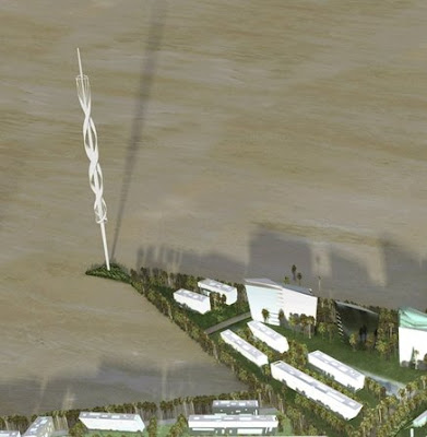
Colin Bloch, RPS director, consultant on the scheme, said: “The power would come from five wind turbines at the points of the star, each 650 ft high and the tallest in the world, and from solar panels, while at least 50% of the water used in the development would be recycled.
“The centerpiece of the scheme would be a recreation of the Taj Mahal which would be the most exclusive boutique hotel in the world.
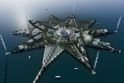
This island consists of two 5 pointed stars, which I think is a great shape for a city to be based on. It allows for a large mixed commercial, retail and leisure (and some residential) central hub with the arms housing the residential neighbourhoods. Basing the residential neighbourhoods on these arms everyone is able to live within close proximity to the sea (or greenspace if on land). Public transport can then run out from the central hub and along the central spine of these arms, with the stops spaced so that they are within a walkable distance of every resident (so the base of the arm no bigger than 400m from the central spine).

Book Notes: Rossington's Radial Rational
The ideal city concept emerged in ancient Greece and was typified by the city of Athens, although like many other cities during this period it was not consciously ‘designed’ but grew in an organic nature in reaction to the acropolis. Plato, however in his dialogues on political theories and the ideal city clearly describes a consciously planned radial city known as the lost city of Atlantis. In Atlantis, the acropolis was also placed in the centre of the settlement and was surrounded by a circular wall and a series of concentric islands divided by waterways which linked into the surrounding ocean. Each concentric island had a clearly defined function (the small inner ring consisted of gardens and temples, the middle island was a military base and the outer ring predominantly agricultural land).
During this time religious beliefs influenced city design and circular cities were associated with cosmic alliance. Therefore the centre of Atlantis held great importance and is an excellent insight into the values of that society. In ancient Greek cities an urban space known as an "agora" would represent the centre of the city and in its function was the heart of the city where social life, business and politics would be discussed and debated. Where a central authority holds power it is common for a palace or temple to occupy the centre. A series of concentric roads can then cut the city up and allow the population to be situated at varying distances from this political centre on the basis of rank and status.
The Greeks themselves did not build any radial ideal cities, neither did the Romans who rejected a circular radial layout in favour of the square grid. During this time the circle and square were hailed as the most perfect geometric shapes because of the work of Marcus Vitruvius Pollio, a Roman writer, engineer and architect on the relationship between proportion and beauty. He recognised that nature’s designs were based on universal laws of proportion and symmetry and symbolized this with an image of a spread-eagled man whose extremities would touch the perimeters of these perfect circle and square figures.
During the Renaissance Leonardo da Vinci popularised this concept with his famous drawing of the Vitruvian Man, and the notion that cities should be designed accordingly with work and life taking place in an ideal space that responds to the rhythm of life. The Renaissance theorists also believed that the workings of the human body could be analogous to the workings of the universe (whereby the square symbolized material existence with lines and right angles expressing will, order and subordination and the circle represented spirituality and a continual cycle of life). As a result, the European Renaissance saw the re-emergence of the ideal city in the form of a radial plan as a diagram of humanist perfection.
In addition to this and more commonly in Renaissance times, the radial city plan was encouraged by military engineers due to its defensive capabilities. Francesco di Giorgio was the first Renaissance architect and military engineer to articulate the ways in which a radial system of streets, a bastioned periphery wall, and a public space in the centre could work together.
The use of a radial layout for the convergence of traffic had been apparent since the Middle Ages in merchant towns with a centralised market place. The widespread use of the stage-coach in the Baroque era facilitated a post-war function for the radial plan as an acceptable city diagram. Its prominence in transport terms was further elevated by the transformation of the city centre into a business district and the introduction of more rapid forms of transport such as the automobile, which emphasised the need for a more coherent system of radial traffic arteries. Due to this development in transportation and the redundancy of city defences, the walls of many previously fortified cities were pulled down and the land turned into a continuous ring road. The majority of the old approaches from the countryside into the city were rationalised into straight radial roads linking the centre to the growing suburbs.
Out of the industrial age came the re-emergence of the ideal city in the form of Ebenezer Howard’s Garden City Movement of 1898. The origins for this movement arose out of Howard’s concern for the poor quality of life in the industrial city and proposed the construction of new self sustaining satellite towns where people could enjoy the benefits of both the town and countryside. The concept of the Garden City consisted of a radial plan divided by six large tree lined boulevards traversing the city from the centre to the rim and split the city into six wards. With an emphasis on community the large public buildings such as the town hall, hospital and library set in large parklands would sit at the centre of the city in the location most accessible to the entire population. Running around the edge of the parkland was to be a wide glass arcade that would house the cities retail and leisure facilities, with the furthest city inhabitant living only 5-10 minutes walk of this ‘crystal palace’. The rings beyond this would consist mainly of residential developments of large well lit and high quality housing and have educational, religious facilities and further parkland interspersed throughout. The outer ring of development would contain the cities factories and industrial sector like the crystal palace the furthest an inhabitant would live from these would be 5-10 minutes walk. Beyond the city would be open countryside designated as green belt to stop the city expanding so that its self sufficiency could be maintained. The Garden Cities were linked to a central city through routes radiating from its centre through a series of rapid transport routes. The outlaying Garden Cities were linked to one another via electric trams by a direct road route and railway lines.
It was around the time of the Garden City Movement that Doncaster’s philanthropic colliery owners started to build housing for their workers. In 1907 Percy Houfton designed Woodlands model village for the workers of Brodsworth Colliery and was seen in its day as an exemplar piece of urban planning and was directly influenced by the Garden City Principles of tree lined boulevards and high quality housing. It was also around this time that the colliery housing at New Rossington was being built with ‘The Circle’ as its centrepiece (much of this area was constructed in the 1920s and 30s). The Circle - the most conspicuous pattern of urban grain in this area and which emerged at this time in reaction to modernist design thinking and the Garden City ideals - has a strong radial plan with a green space at its centre and a number of large residential properties, a church, public house and community hall encircling the central space. Around this inner ring are two rings of terraced residential properties before the plan merges back into a more traditional grid layout. In the corner spaces left over from the transition between square and circle are located further community buildings and the market place and the retail centre located along the circles northern axis. Although there are no references in historical texts about any influences on New Rossington’s housing layout the area does seem to embody an element of the Garden City philosophy with rings of housing around an area of greenspace and community buildings.
Book Notes: The Social Life of Small Urban Spaces - W H Whyte
Commuter distance is usually short, usually around 3 blocks
The best used plazas are sociable spaces
You find a higher proportion of couples and groups, more people meeting each other or exchanging goodbyes.
When people go to a place in groups of 2 or 3 or rendezvous there, it is most often because they have decided to
They also attract more individuals, if you are alone a lively place can be the best place to be
Most used paces also tend to have a higher proportion of women - women are more discriminating than men to where they will sit
Men tend to take front row seats and if there is a gateway men will be the guardian of it
Women favor places slightly secluded
Self congestion
"What attracts people most, it would appear, is other people"
Many spaces are designed as though the opposite is true. If you ask people they tend to say they want to 'get away' from it all, go to a 'retreat' an 'oasis'. What people do however, reveals a different priority
When people stop for a conversation they don't move out of the main pedestrian flow in a street, they would stay in it or even moved into it. It could be because in the centre of a crowd you have the maximum choice to break off.
People also sit in the main stream and position themselves near objects (fountain, statue)
People stop in well defined spaces, they rarely choose the middle of a large space
People like to have a full view of all comers but keep their rear covered
Sitting space
People don't look up at buildings but whats going on at eye level
Sheer space does not draw people, in some circumstances it can have the opposite effect
The most popular plazas tend to have considerably more sitting space then less used ones
Sitting should be physically comfortable BUT it is more important that it be 'socially' comfortable - this means choice (up front, in back, side, in sun, in shade, groups or alone)
People will site almost anywhere between a height of 1 - 3 feet (30 - 90cm)
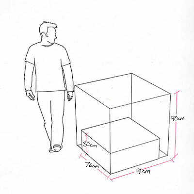
Ledges and spaces 2 bums deep seat people more comfortably - 30inches (76cm) will do but 36 (91cm) is better. However this will not double the number of people using the space, but will give people more choice (more socially comfortable)
Steps allow for a range of space for an infinity of possible groupings and excellent views of the street. So make steps big enough to sit on!
All things being equal you can calculate that where a pedestrian flow bisects a sittable place, that is where people will most likely sit. Circulation and sitting are not antithetical but complementary.
Benches that are fixed cant be moved if they dont work. Experiment first.
Chairs enlarge choice (move into sun, out of it, into groups or alone)
If you know that you can move when you want to, you feel more comfortable staying put. People often move a chair a few inches before sitting down about where they started as a declration of autonomy, to oneself.
Fixed individual seats are NOT good. Social distance is a subtle measure, and ever changing but the distance of fixed seats dont. They are rarely quite right for everyone.
Where there is a choice between fixed seats and other kinds of sitting, it is the other that people choose.
It may be less expensive to trust people and buy replacements periodically than to have someone gather in chairs every night.
Sun, Wind, Trees and Water
The best time to sit under a tree is when there is sunlight to be shaded from.
The more access to the sun the better. People will actively seek the sun and given the right spots they will sit in surprisingly large number in quite cold weather.
What people seek are suntraps and the absense of drafts and wind are as critical for these as the sun. Most new urban spaces are either all indoors or all outdoors, more can be done to encourage inbetweens. Semi outdoor spaces could be created that would be usable in all but the worst weather.
Tall freestanding towers can generate tremendous drafts
By far the best sitting spaces are those affording a good look at the passing scene and the pleasure of being comfortably under a tree while doing so. This crovides a satidfying enclosure; people feel cuddled, protected very much as they do under the awning of a street cafe.
If trees are planted closely together, the overlapping foiliage provides a combination of sunlight and shade that is very pleasing.
One of the best things about water is the look and feel of it, so people need access to it. Its is not right to put water before people and them keep them from it.
Another great thing about water is the sound of it. It can mask noise and conversations, so you can talk quite loudly bet still enjoy a feeling of privacy.
Food
If you want to seed a place with activity, put out food! Vendors are the caterers of the city's outdoor life. When they are moved on a lot of the life of the space goes with it.
Food attracts people who attract more people
Bunch them together and group tables closely together and as a consequence people are compressed into meeting one another.
The Street
The relationship to the street is integral and is by far and away the vritical design factor. The area where the street and open space meet is key to success or failure. Ideally the transition should be such that its hard to tell where one ends and the other begins.
Steps up to a space should be low and inviting so you can drift up.
Sightlines are important, if you dont see the space they dont use it.
Unless there is a compelling reason an open space shouldn't be sunk. They are dead spaces. People look at you, you dont look at them.
The "Undesirables"
IF good places are so benifitial why are there not more of them? The biggest single reason is the problem of undesirables! They themselves are not the problem, its the measures taken to combat them that is the problem.
Places designed with disrust get what they are looking for.
You will find winos elsewhere, but it is empty places they prefer; it is the empty spaces that they are conspicuous almost as if the design was contrived to make them so.
The best way to handle the problem of undesirables is to make sure it is attractive to everyone else
The way people use a space mirrors expectations. There are never problems in spaces that are well used; they become self policing.
Putting up barriers to deter undesirables usually only stops other people from using the space, much to the delight of the undesirables.
The Blackout Bus
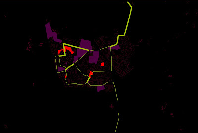
The Blackout
Below the most used/public green spaces are in the brightest with the lesser/more privatised spaces getting gradually darker. This plan not only shows where the most used spaces are and where there is a lack of greenspace, but also how the spaces connect with each other and which spaces need to be improved/expanded to create a stronger green network.
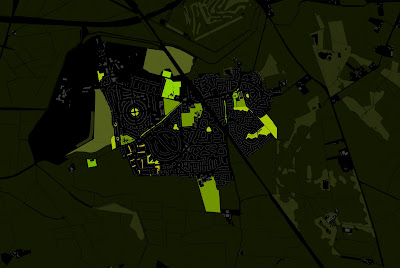
Below the technique allows you to easily identify the movement hierarchy of a town and the 'voids' of space where new connections are needed.
Underground Zoo
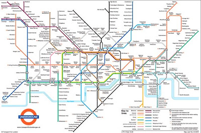
*Someone* has however has looked at the map in a way no one has ever thought of before and has seen a whole world of animal life contained in the network of underground tunnels.
Roadsworth
I really like the sentiment behind this graffiti and think that it conveys some very strong messages about how the car and roads are so dominant in the urban landscape, with its needs prioritised over the pedestrians.

Is this trying to express that people shouldn't be forced to cross roads at designated points. Could it be the case that once a crossing is designated on a street then this will be the only place that people will ever be able to cross at. Cars wont slow to allow pedestrians cross anywhere else on the street because they think the pedestrians should be using the crossing, thereby forcing pedestrians to use the crossing even if it is out of their way to do so. Prehaps if that crossing was never there then pedestrians would attempt to cross the road an numerous points making cars more cautious and so more likely to slow down and allow pedestrians to cross? Does..........

Are car parks destroying destroying the fragile and beautiful natural landscape? The more dominant we are on the car the more we need car parks. The more car parks we build the less greenspace we have. The less greenspace we have the less we are likely to want to do for a walk. The less we walk the more dominant we are on the car. The more dominant we are on the car...
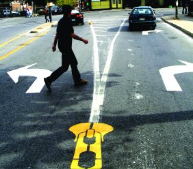
Are roads tearing communities apart? Unzipping socail connections?
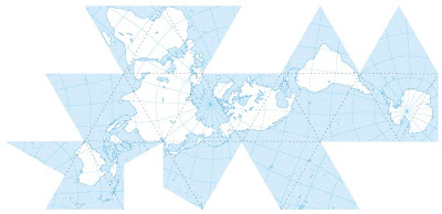
Dymaxion Map
Nolli
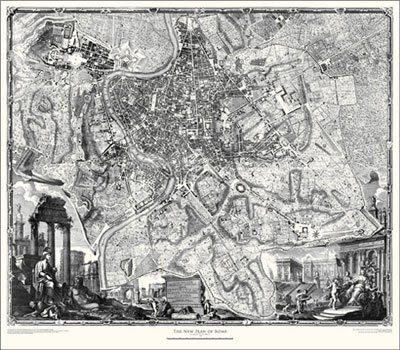
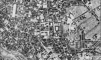
The Nolli map provides an immediate and intuitive understanding of the city’s urban form through the simple yet effective graphic method of rendering solids as dark gray (with hatch marks) and rendering voids as white or light shades of gray to represent vegetation, paving patterns and the like. The city, thus conceived as an enormous mass that has been "carved" away to create "outdoor" rooms is rendered intelligible and vivid through this simple graphic convention.
Letting your Hands do the Talking
